How to design a billboard: Effective Billboard Design
When it comes to outdoor advertising, capturing the fleeting attention of consumers is the aim of the game. With mere seconds to make an impression, taking the time to implement simple billboard design principles can significantly enhance the effectiveness of outdoor campaigns. This blog post delves into the insights gleaned from a comprehensive presentation on outdoor design and creative best practices.
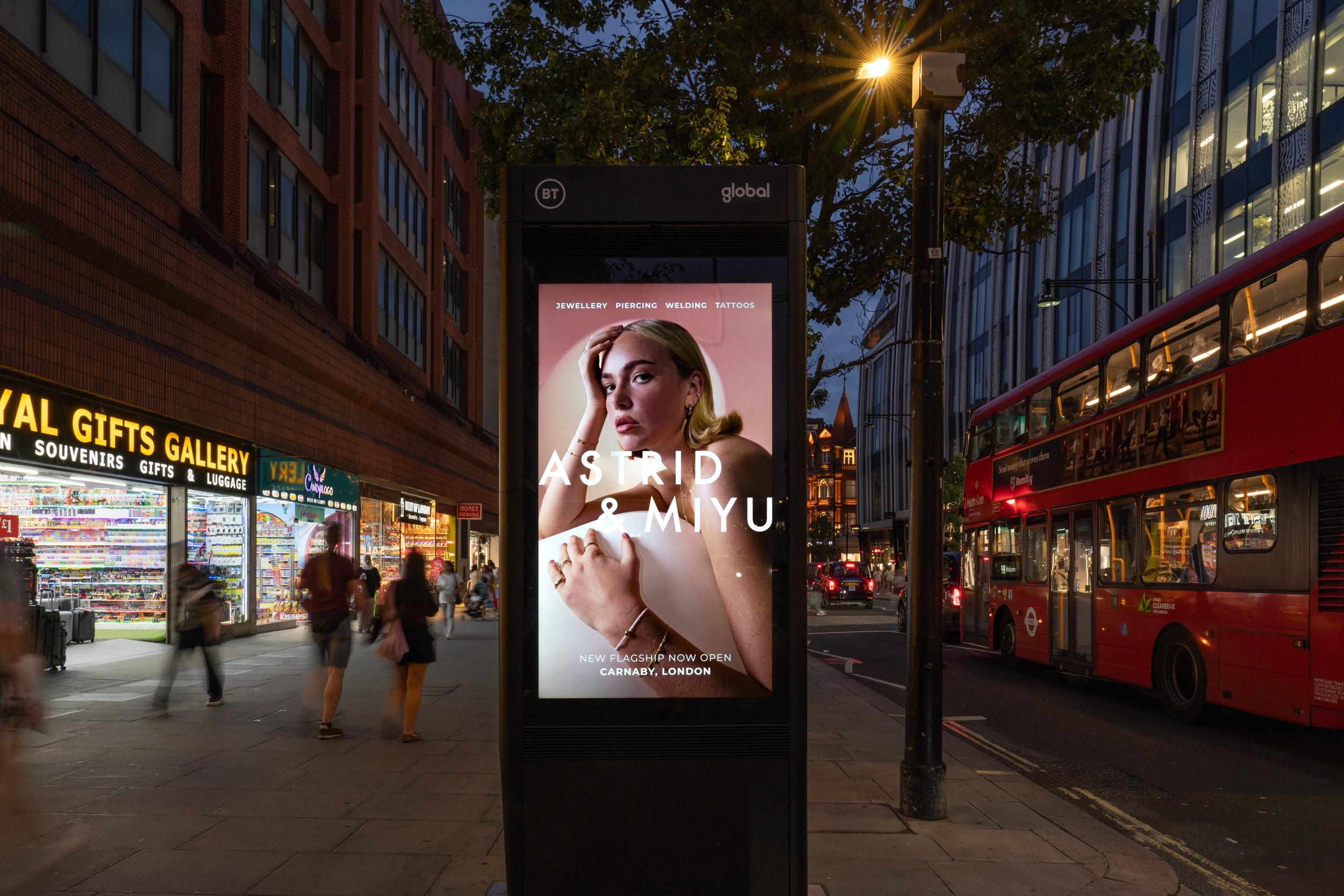
Example of a great Outdoor Billboard for the brand Astrid & Miyu.
The Power of Visual Elements in Billboard Design
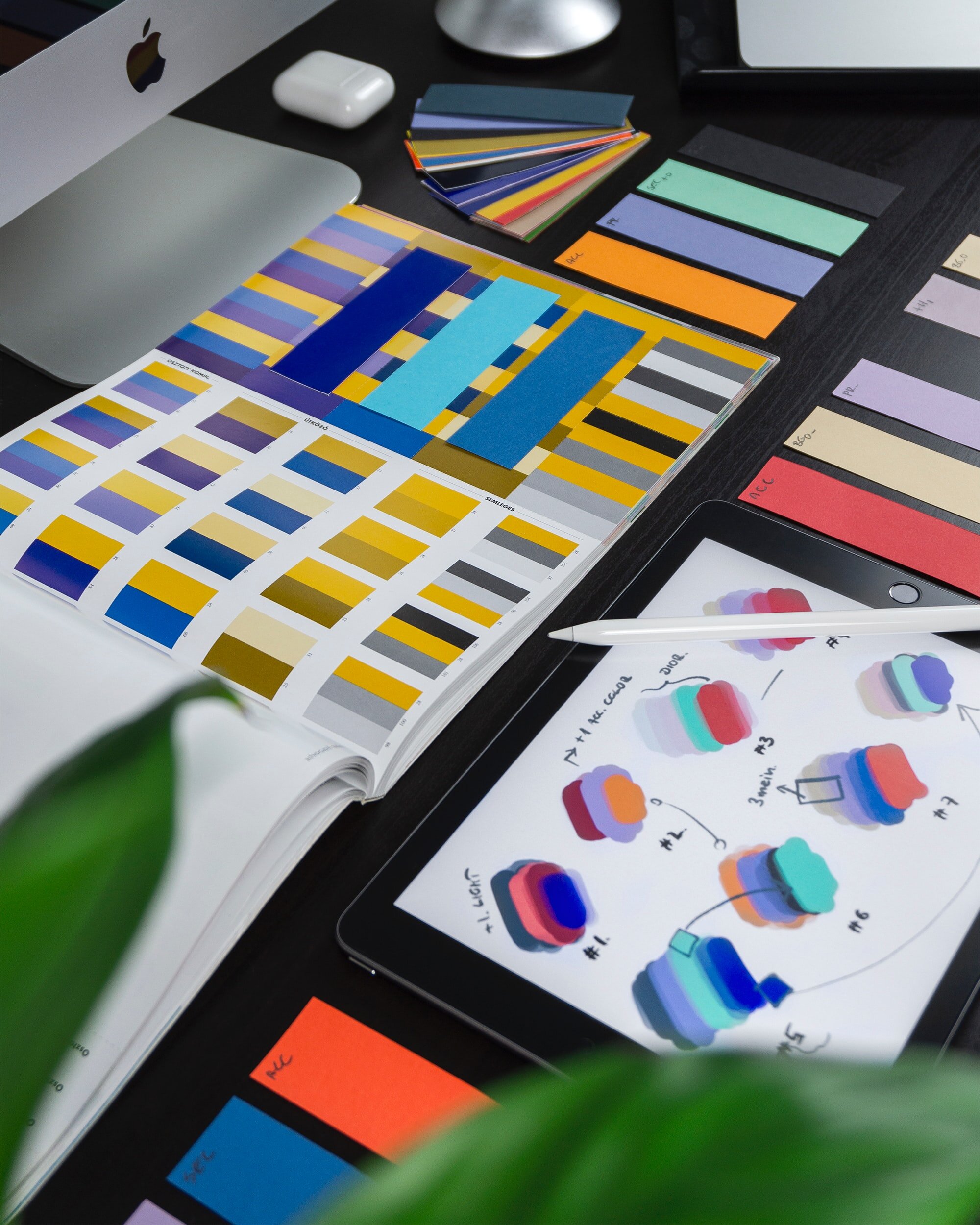
Vibrant Colors: The strategic use of vibrant colours is a cornerstone of effective outdoor advertising. Vibrant hues not only demand attention but also evoke heightened emotional responses, making the advertisement more memorable.
Distinctive Colors: When vibrant colours are also distinctive to a brand, they serve a dual purpose: driving emotional impact and swiftly cueing brand recognition. This synergy reduces neutrality and fosters positive associations.
Fluent Devices: Incorporating fluent devices, such as brand mascots or signature slogans, enhances creative effectiveness by a third. These devices act as visual cues that trigger immediate brand recall.
Brand Boldness: In the absence of fluent devices, being brand-bold is essential. Ensuring the logo is large and prominently positioned at the top of the poster significantly boosts attention and brand recall.
Product and Performance Design Tips
Expand Product Images: Larger product images command attention and hold it for extended durations. Doubling the product size can lead to a remarkable 86% increase in average view time.
Play with Product: Injecting humour and creativity into product presentation not only captures attention but also drives emotional engagement and brand recognition.
Shout Your Call to Action: A larger, more prominent call to action (CTA) results in a longer dwell time and stronger impact, making the creative idea more effectively resonate with the audience.
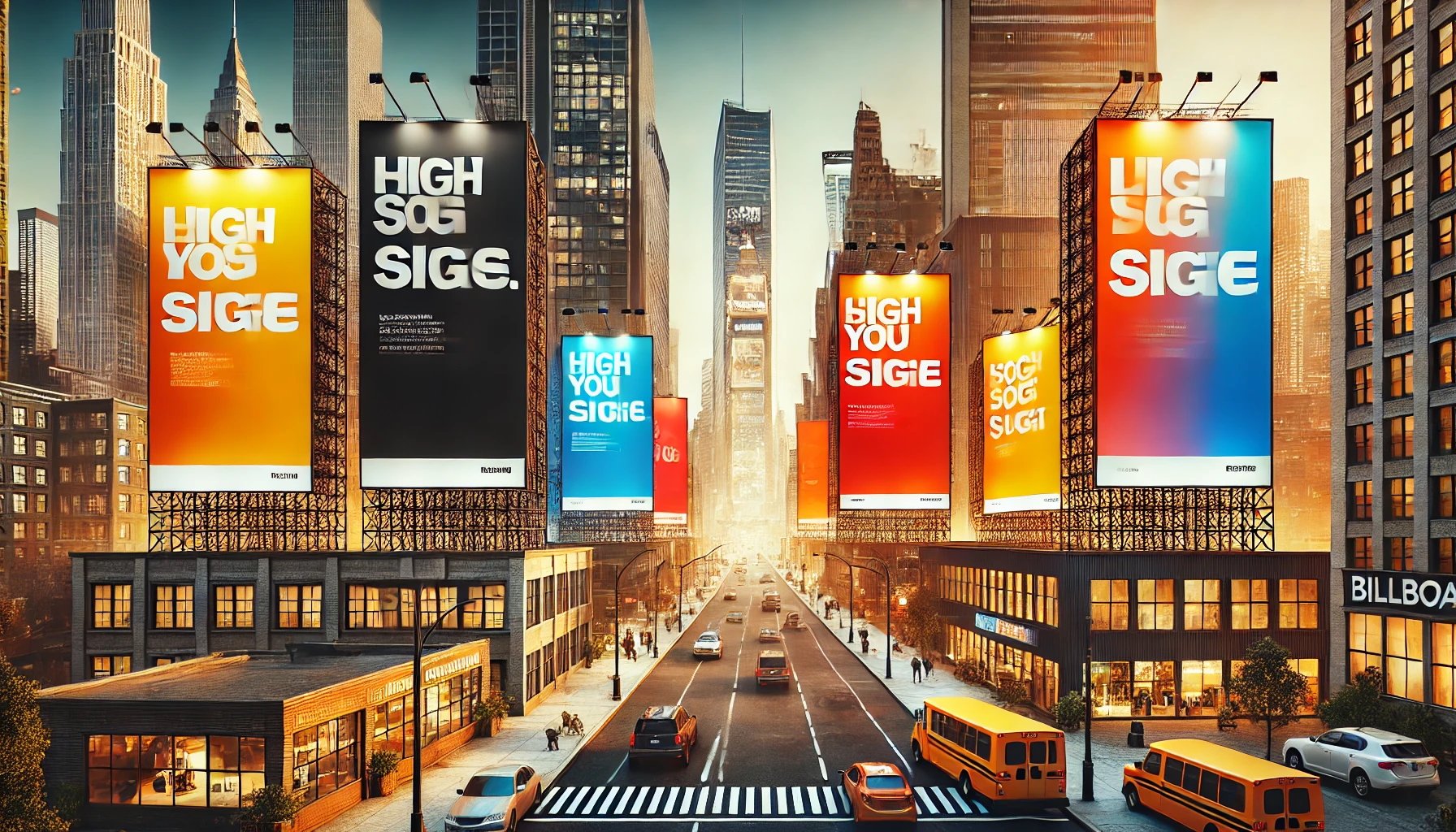
Perfect example of an effective Billboard Ad.
Composition and Creativity Design Tips
Short, Snappy Copy: Concise copywriting is key to long-term brand impact. Limiting copy to a maximum of 6 words enhances memorability and brand recognition.
10-Year Taglines: Crafting memorable and transferable taglines that encapsulate brand essence contributes to long-term brand building.
Showcase Faces: Human faces are inherently attention-grabbing. Incorporating characters and expressions into outdoor creatives increases view time and fosters emotional connections.
Here’s How to Make Your Billboard Design Stand Out
To create impactful outdoor advertising, employ vibrant colours, limit on-screen elements to a maximum of three, leverage fluent devices and distinctive colour codes, and strategically position larger logos at the top of the creative. Expanding product images, using creative product presentations, and featuring prominent CTAs are essential for maximizing short-term impact and driving sales
Finally, shorten copy, showcase faces, and drive familiarity through consistent brand elements to create emotionally resonant and enduring outdoor campaigns.
By understanding and implementing these outdoor design and creative best practices, brands can elevate their outdoor advertising efforts and achieve greater success in capturing consumer attention and driving desired outcomes.


